If you have ever paid a visit to the hallowed halls of our shop in Turl Street, you will have noticed that we really like books. Like, really like them. Our days would, frankly, feel incomplete without straightening a shelf of beautifully bound tomes, and often sneaking a peek between the covers in the process. As the weather is drawing in, and Autumn officially begins on Friday, we felt it would be pertinent to shed some light on a book we think you should all be cosying up with as the nights draw in: our Treasury of Irish Literature. Today, we wanted to give an overview of the Irish storytelling tradition, before giving you a quick rundown of just four of the thirty authors present in this magnificent volume.
Oral tradition of Celtic storytelling
The history of Irish folklore and myth was, originally, an oral one. The oral tradition of storytelling in Ireland was arguably one of the strongest across the world, with dedicated storytellers called Seanchaí being tasked with the upholding of the country's legends by mouth alone. Up until the 16th century, this role was highly respected, with their rank in society being close in both reverence and working relation to royalty. The English conquest of Ireland at this time reduced the importance of the Seanchaí within Irish society drastically, but they did not simply disappear. These storytellers knew that their job was simply too important to give up on, and so they continued to travel between towns, regaling residents with the tales of old at local events.
The stories these Seanchaí told generally held to one of four main cycles of Early Irish Literature: the Mythological Cycle, the Ulster Cycle, the Fenian cycle, and the Cycle of Kings. They did, however, tell folk stories as well, which related more closely to the lives of the people who would crowd round to hear them wind their literary paths. Though the modernisation of communication has diminished the role of the Seanchaí further, the tradition still continues, as many feel it is of deep importance to keep grounded to the roots of Irish storytelling. In keeping with this view, the Treasury of Irish Literature begins by outlining some of the traditional poems and ballads passed down in this manner, before moving on to the first poet in the tome:
Thomas Moore (1779-1852)
Thomas Moore is, for many, the quintessential Irish poet, and is widely credited with the initial surge in popularity for using English rather than Irish in verse with his Irish Melodies, first published in 1808. Born in Dublin in 1779, Moore's literary ambitions became clear from a young age, with his first piece of work being published in a literary magazine when he was only 14. He was one of the first Catholics to be admitted to Trinity College in 1795, where he studied law, with his first full collection of verse being published in 1801 following his move into the literary circles of London.
Over the next decades he made many high-powered acquaintances, including Founding Father and 3rd President of the United States of America Thomas Jefferson, the Prince Regent and future King George IV and, in a more literary vein, Lord Byron. Moore and Byron's friendship was so enduring that, at their last meeting in Venice, October 1819, Byron entrusted Moore with his journals, to be published after his death. The journals were so scandalous that a party of Byron's closest friends and family attempted to burn them before Moore could release them unto the world, but thankfully Moore managed to save a god chunk of the material, much to the party's consternation.
Moore's literary output is of incalculable value to Irish literature, and its impact on the country's artistic soul is almost second-to-none, but perhaps one of hos most interesting contributions to Ireland's history is that he is, more than likely, the very first Irish person to ever be photographed. A calotype (an early form of photographic process) shows him stood with family members of William Henry Fox Talbot (pioneer of the calotype, and next-door neighbour of the Moores), dated April 1844. The friendship between the two men also lead to photographs of Moore's handwriting being published by Talbot in the The Pencil of Nature, the first commercially available book to contain photographs.

Katharine Tynan-Hinkson (1859-1931)
A less recognised figure in Irish literature, Katharine Tynan Hinkson was nonetheless incredibly influential in the country's literary history. Born in Dublin in 1859, Tynan-Hinkson was of strong literary stock: her sister Nora was a poet as well, and her daughter Pamela's writing was celebrated throughout the 20th century. She was often at the centre of Dublin's literary circles, and had a great influence over many who swam in them, until her husband's work necessitated a move to England in the early 1900s. Tynan-Hinkson's work was deeply informed by Celtic mythology, just like that of her regular correspondent W.B Yeats, who she supposedly rejected a marriage proposal from in the 8 year period of their friendship before she married.
No other writer on this list comes anywhere close to being as prolific in their output as Tynan-Hinkson, and that's not altogether surprising. Alongside her wealth of poetry, she published five volumes of autobiography over a period of 11 years, and purportedly wrote over 100 novels in her 44 year literary career. Few authors could dream of such productivity, even with today's technological aids, and she is rightfully remembered for this incredible feat, as well as for the beauty and patriotism of her verse.
W.B Yeats (1865-1939)
One of 20th century literature's most lauded sons, W.B Yeats brought the Irish tradition to the modern world in a major way. Split into two distinct phases, his work deals with two of the most central themes in much of Irish writing: mythology and politics. His earliest work was heavily influenced by Celtic mythology - like that of Katharine Tynan-Hinkson - alongside being influenced by the occult: the young Yeats had a decided bent towards all things mystical. In his seminal essay The Celtic Element in Literature, he credited the 'Fountain of Gaelic Legends' with the revival of Celtic influence over the period's writing, stating that its effect would create 'a new intoxication for the imagination of the world'.
His obsession with the spiritual and mystic sides of life never ebbed, but it did give way in his work for more serious political themes, in response to the fraught times he lived in. The extent of his radicalisation with regard to the Irish nationalist cause can be credited at least in part to his infatuation with Maud Gonne, an ardent proponent of Home Rule, to whom he proposed four times over the course of their acquaintance (he was rejected each and every time). His most affecting political poem, Easter, 1916, is published in the Treasury, and versifies the Easter Rising of April 1916, a key event in the fight for Irish independence. In 1923, a year after becoming Senator of the Irish Free State, he won the Nobel Prize for Literature, in recognition of the fact that his poetry managed to capture the spirit of an entire nation.
Interestingly enough, Yeats actually spent a fair time in and around Oxfordshire throughout his life. In the 1920s, he lived in a house on Thame High Street with his family, and his son Michael was even born there. A blue plaque has been placed on the building to commemorate his time spent there.

There is even a chance - brace yourselves - that Yeats could have visited 3 Turl Street, the home of yours truly! In the 1920s, Yeats and his wife lived at 45 Broad Street - a mere 3 minute walk from our front door - for two months, before they found a more permanent home elsewhere in the county. The building we are nestled in is over 600 years old (hence the ceilings, sorry) and has at various times been a bank, a butchers and, for a good chunk of its existence, a bookshop. We don't have exact dates, but we know that Blackwell's had a second-hand bookshop here for a long while, so it is likely that this enterprise was present during Yeats' time in Oxford! Be sure to remember, next time you enter into our little corner of the world, that you may well be walking in the footsteps of literary legends...
James Joyce (1882-1941)
No repository of Irish literature could possibly be considered complete without at least some work by one James Augustine Aloysius Joyce, perhaps the best known Irish literary figure of all time. Joyce is best remembered for his 1922 novel Ulysses, which brought much trouble down upon the head of its author and publisher due to the obscene nature of many of its passages. The work was flatly banned in the United States and England, not being made legal until 12 years later by the former, though by that time many copies had been snuck into the country anyway, not least due to a concerted effort by fellow author Ernest Hemingway.
Ulysses changed the way literature functioned all across the globe, and continues to top list of the most influential works of all time to this day, a century after its initial publication. Despite a relatively small literary output compared to many of the authors in this anthology - one play, three poetry collections, a single short story collection, and thee novels - no single writer in the Treasury can be said to have influenced the way the modern literary world works more than Joyce. In this collection, you can experience eight of his poems, and his most accomplished short story The Dead, before fully immersing yourself in the Joycean canon with an unabridged printing of his entire first novel A Portrait of the Artist as a Young Man.
These are just a few of the marvellously inventive, endlessly lyrical, and continually poignant names you will find between the covers of this magnificent anthology. If you want to get your hands on a copy before this Friday's equinox, you can visit the shop today. If you are sadly unable to take a stroll down blessed Turl Street at this time, the anthology can also be purchased through our online store here.
Go n-éirí an bóthar leat, Scriptum blog readers x

]]>


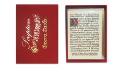 We love opera. As soon as you step into Scriptum, you undergo a sensory assault of the best kind: colourful and complicated objects throng your vision, the scent of leather and paper envelops you, and a wave of soaring operatic sound washes over you. Azeem is a dedicated Rossini and Puccini fan, so on sunny Oxford afternoons we enjoy brightly cheerful melodies and gracefully tragic arias in turn, while on grey and gloomy mornings I wrest control of the music to revel in the dismal splendour of both Wagner's moments of brilliance and his terrible half hours*. Customers, catching a half-remembered strain as they browse, frequently ask us what is playing. Some music buffs don't actually ask, they announce "Lovely recording; this is Callas, of course... La Scala, 1953, wasn't it?" Yes, it was, we answer, a little awestruck.
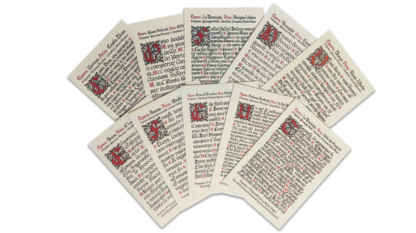
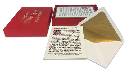
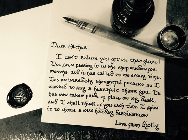
 When the main aria was done, I gave each card a bright red inset first letter illustrated with a floral background, as a nod to medieval manuscript illumination. I also bookended each aria with interesting facts about each opera's premiere and role originators (the best name to write, without a doubt, was the superbly monikered Giuditta Pasta, who was the first to sing Casta Diva). Finally, we designed the box to include my favourite musical phrase from Tosca; test out your sight-reading by having a look at the notes and seeing if you can sing it!